01 / THE CHALLENGE
What needed solving
Create a modern identity that is minimal yet expressive. Design an identity with the same layered intentionality and narrative found in architecture. Ensure consistency across branding and web without visual fatigue. Differentiate within a market of formal, predictable design systems.
02 / THE APPROACH
How it took shape
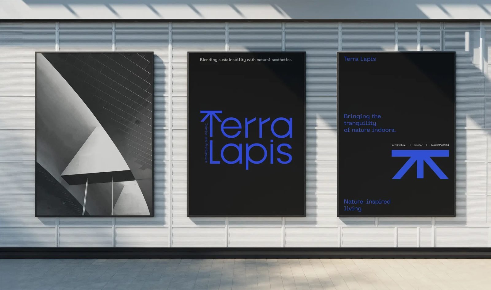
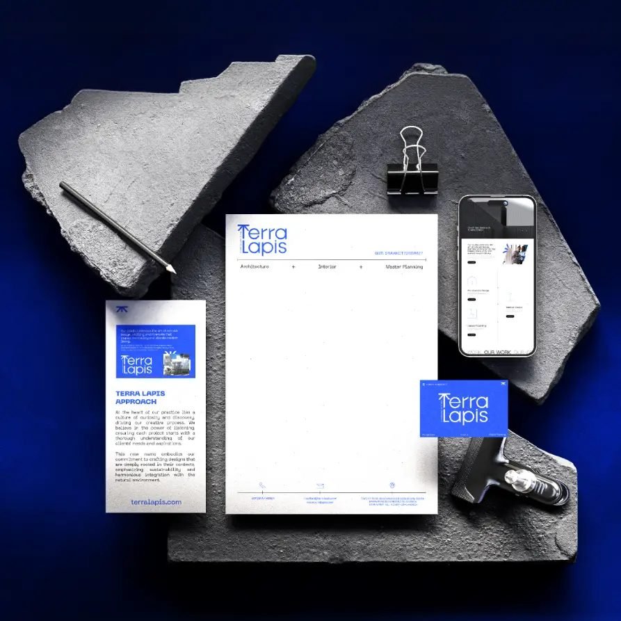
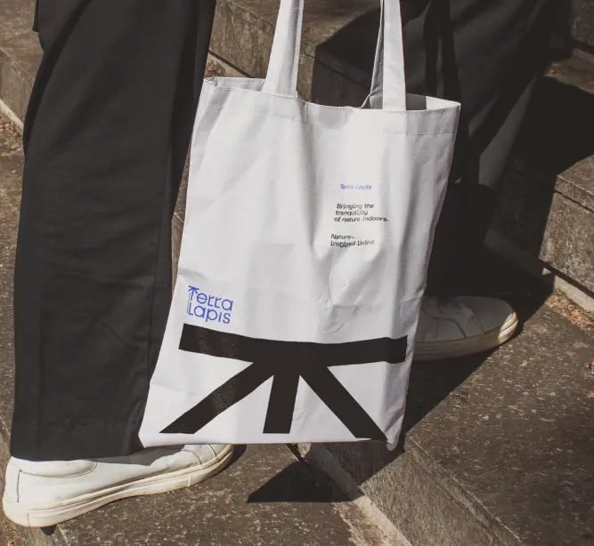
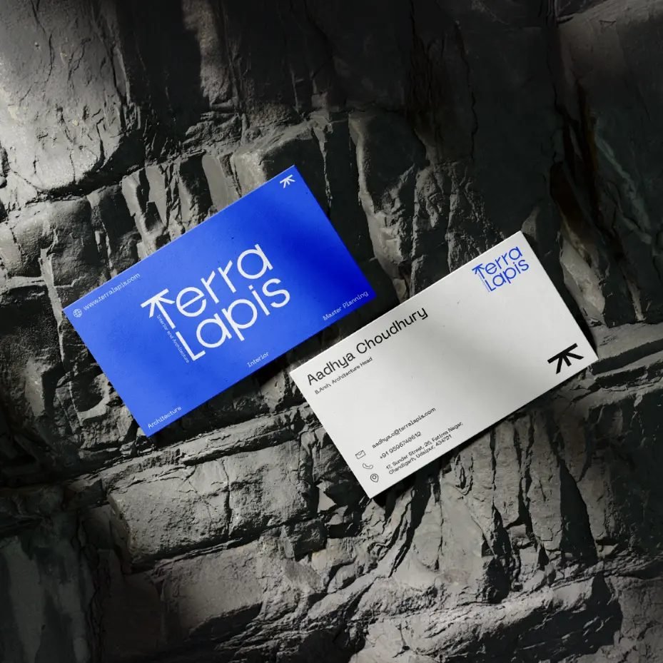
We designed a visual system rooted in architectural form and nature-first inspiration. The logo draws from the Japanese character for 'tree' to form the 'T,' while the 'L' uses a minimal wireframe structure inspired by architectural sketches. A palette of black, white, and blue keeps the tone clean and modern, aligning the brand with both design precision and environmental intent.
03 / THE RESULT
What was delivered
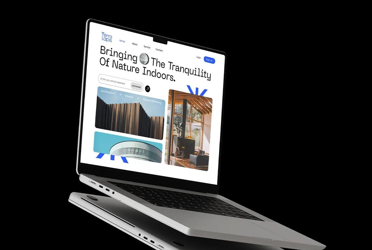
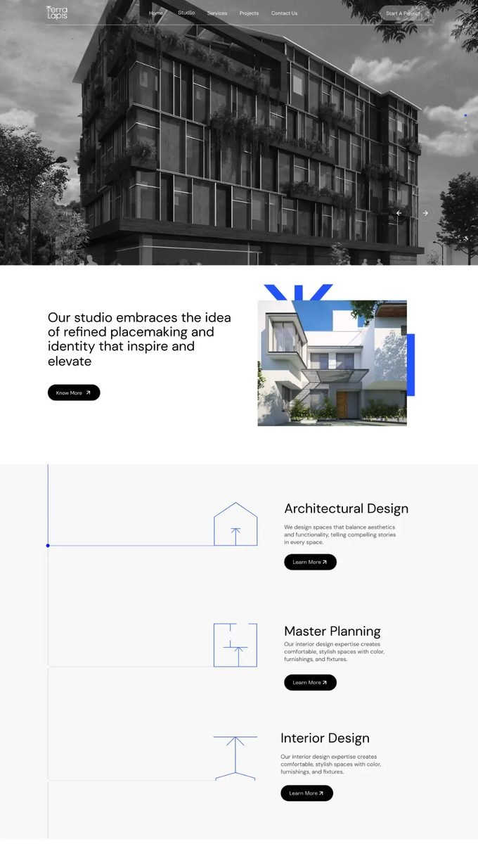
The revitalized identity and web experience have redefined how Terra Lapis shows up in the industry. The brand now speaks with a tone that is informed, confident, and in sync culturally. It communicates three decades of legacy and practice, not through volume, but through coherence. We've given Terra Lapis another spin on what it means to be a leader in expressive and environmentally-aligned design.