01 / THE CHALLENGE
What needed solving
Building a kidswear brand that speaks to modern mothers without slipping into playful or predictable visual tropes. Translating global fashion sensibilities into looks that feel aspirational, wearable, and socially relevant in the local context. Creating a visual and digital system that supports frequent drops, fast trend cycles, and high style expectations without losing coherence. Balancing expressive fashion imagery with commercial clarity across packaging and app experience so style leads, but usability never falls behind.
02 / THE APPROACH
How it took shape
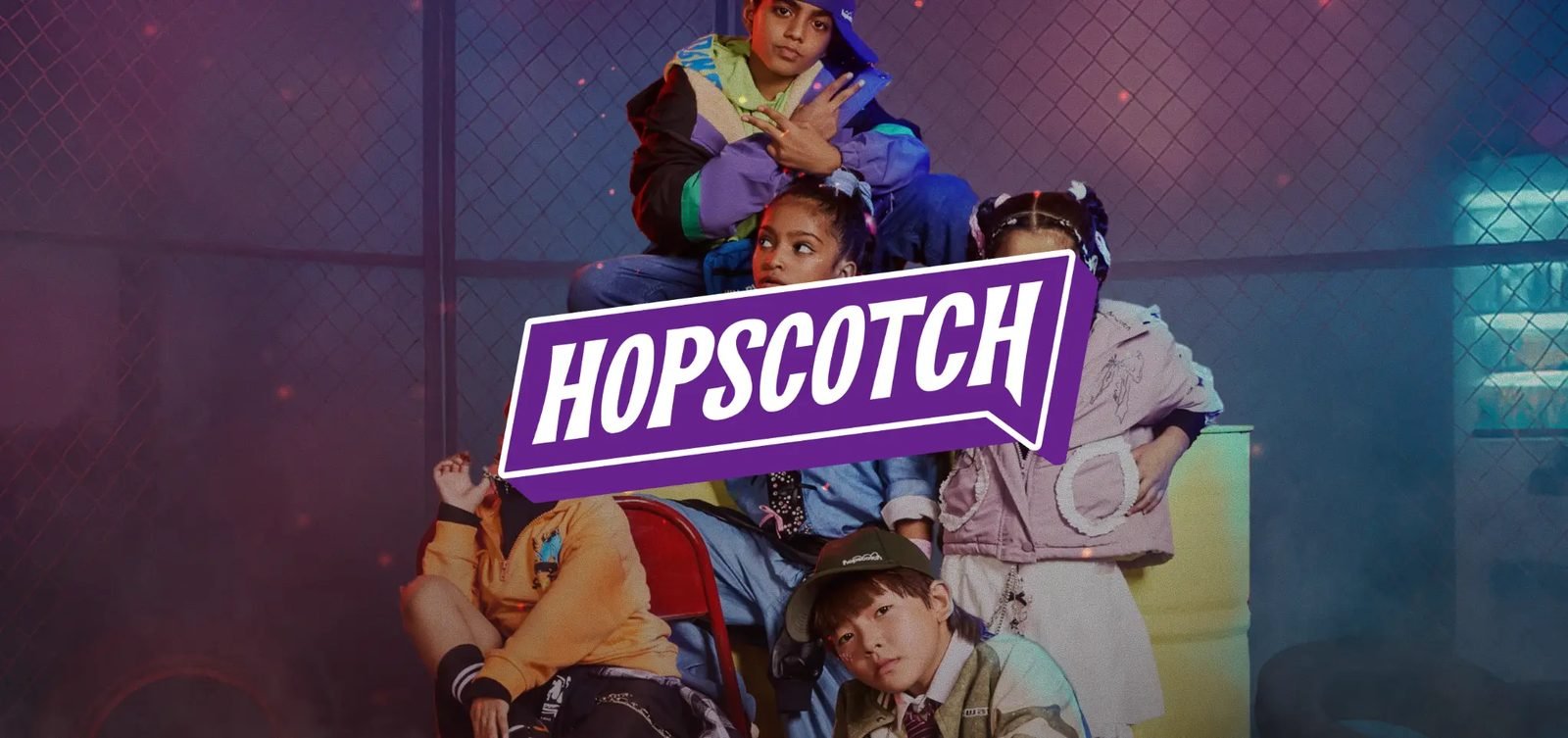
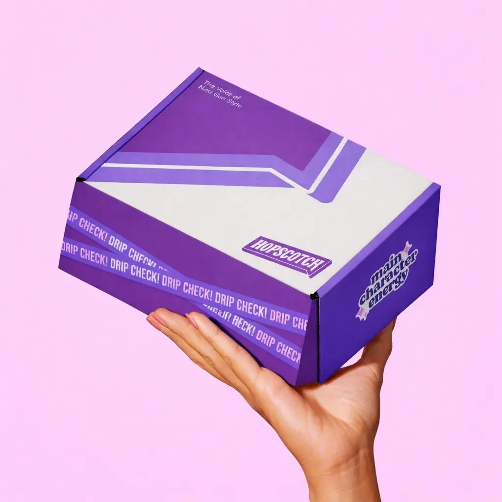
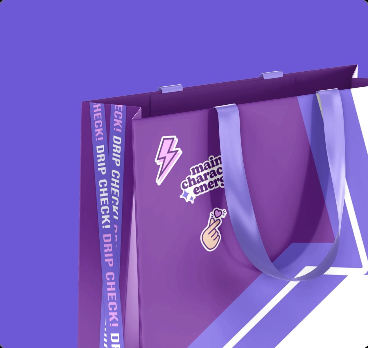
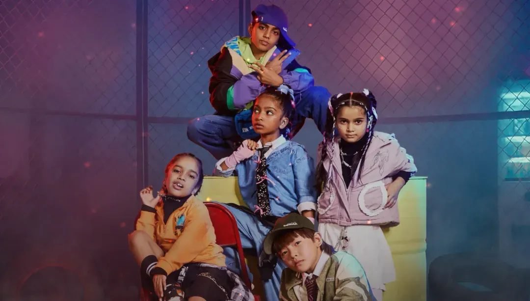
Hopscotch was shaped with a clear point of view from the start. Every decision was guided by how modern mothers see style; as instinctive, considered, and never overdone. The identity carries confidence without noise, allowing fashion to lead naturally. Packaging was stripped of visual shortcuts, favouring presence over playfulness. The app experience flows around moments, making curation feel intuitive. Together, each touchpoint moves at the pace of fashion, while remaining unmistakably Hopscotch.
03 / THE RESULT
What was delivered
The refreshed brand positioned Hopscotch as a clear style reference in a crowded kidswear market. The sharper identity, fashion-led imagery, and intuitive app experience made discovery feel effortless while raising the bar for everyday dressing. Packaging and visuals reinforced consistency across touchpoints, helping the brand show up with confidence at every moment that mattered. Together, these shifts strengthened recall, perception, and supported faster engagement with a growing base of style-driven modern mothers.