01 / THE CHALLENGE
What needed solving
Design an iconic logo with enough edge to be memorable and enough restraint to feel premium. Create a voice and system that speaks to culture without mimicking it. Distil multiple functions into a fluid, magnetic user journey. Execute a fast go-to-market without compromising on craft.
02 / THE APPROACH
How it took shape
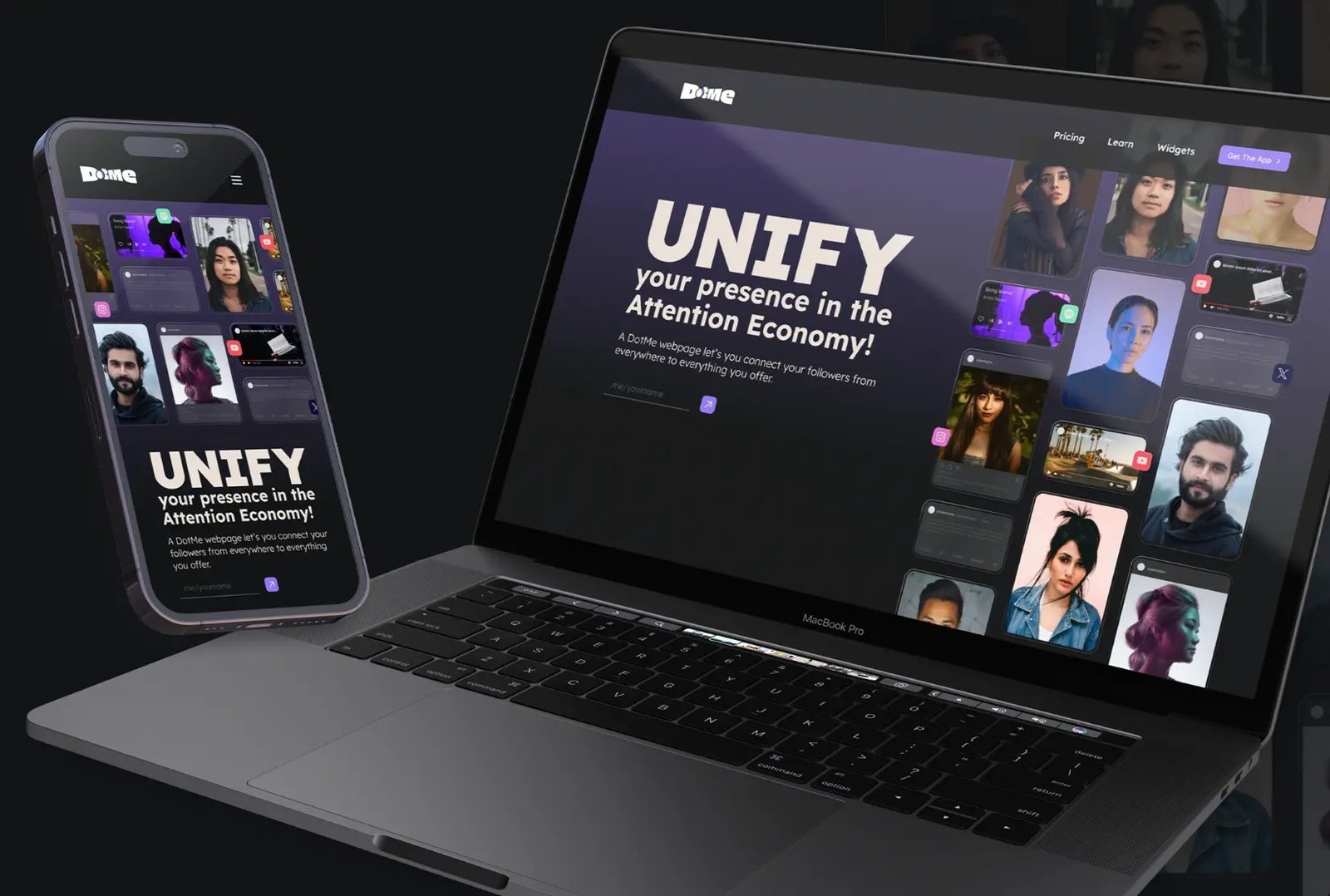
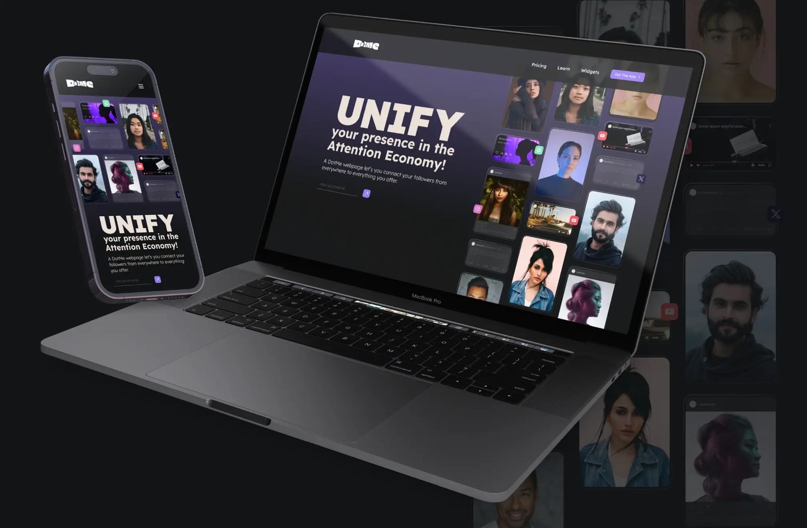
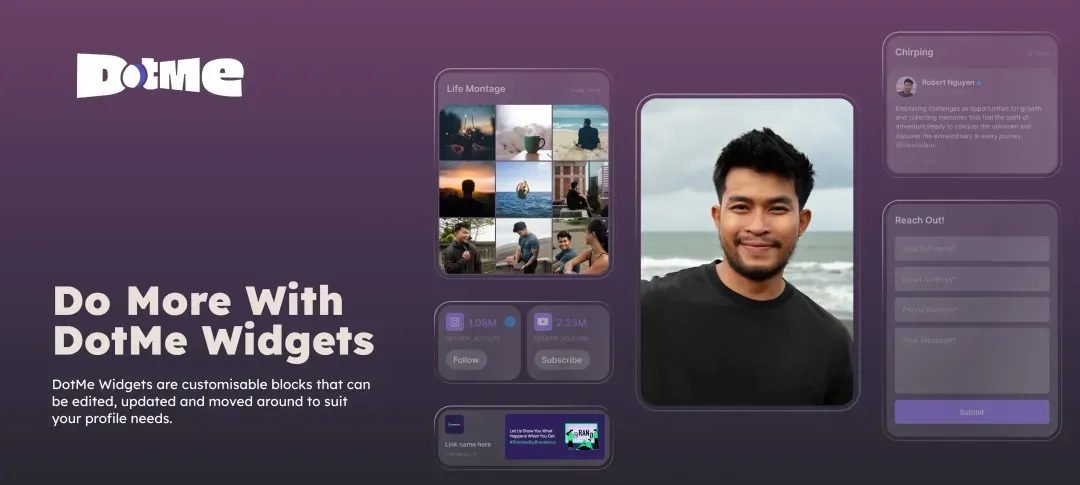
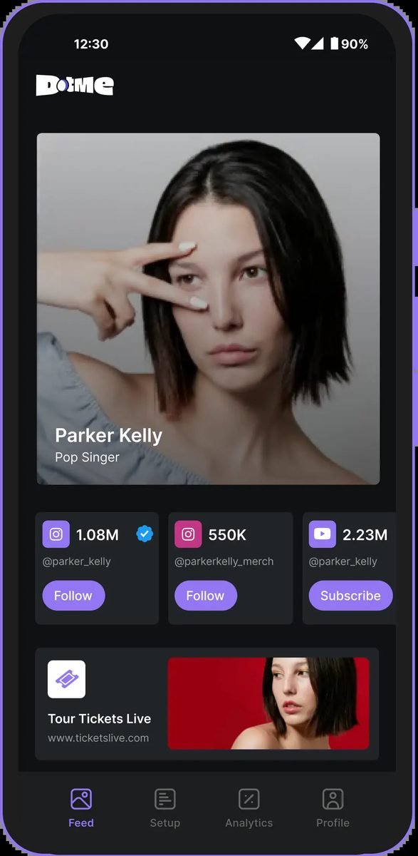
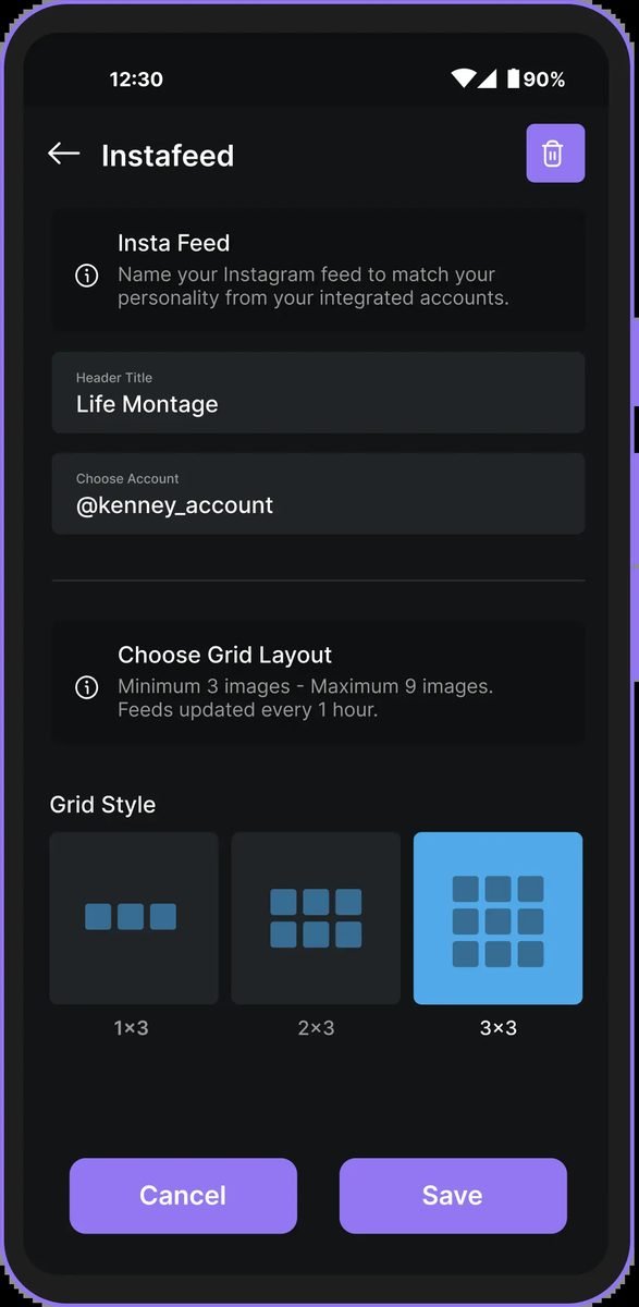
DotMe’s identity system was built to flex. The logo is clean but supercharged. The color palette is confident. Typography walks the line between tech-forward and lifestyle-aware. The interface moves like the people using it; fast, intentional, and built for connection. We stripped away anything that looked like filler or unfunctional. What stayed was sleek, stylish, and wired for scale.
03 / THE RESULT
What was delivered
DotMe did not just launch. It landed. The brand earned its space in a competitive market by being unapologetically polished and unmistakably relevant. It brought creators the tools they needed, with a system they actually wanted to use. And that made all the difference.