01 / THE CHALLENGE
What needed solving
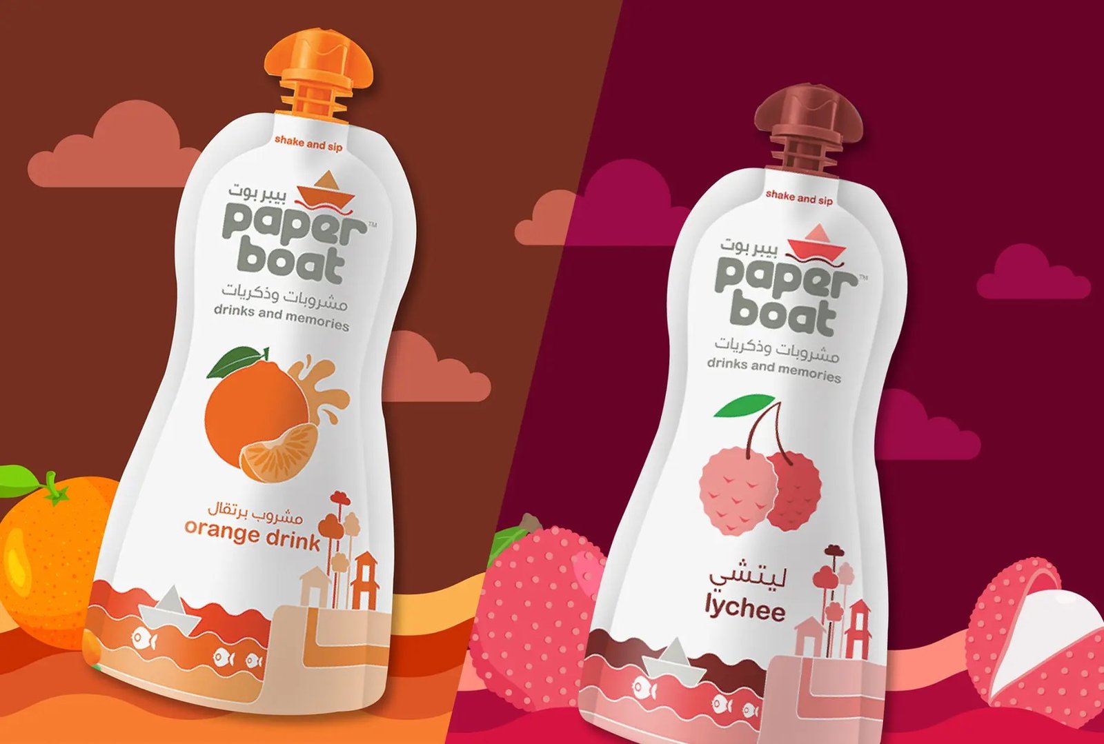
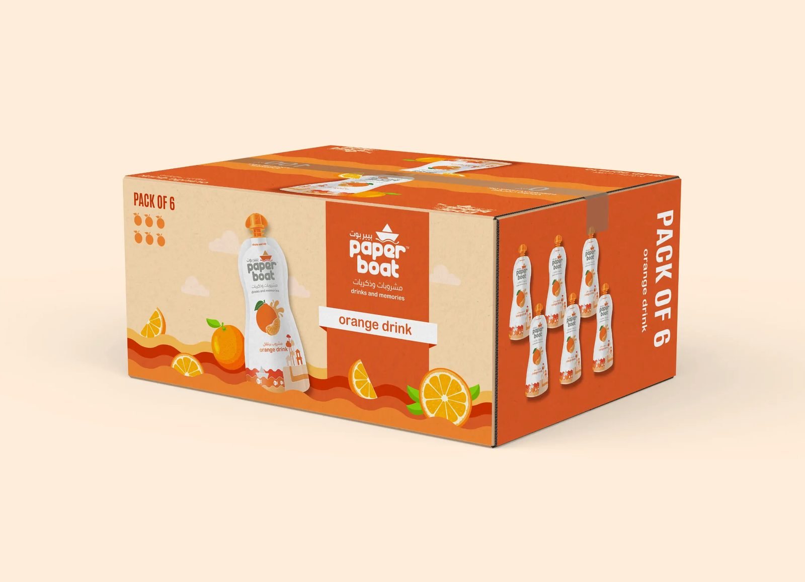
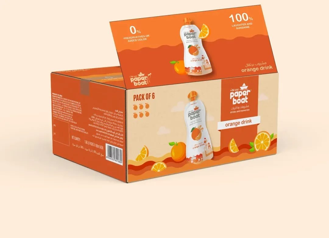
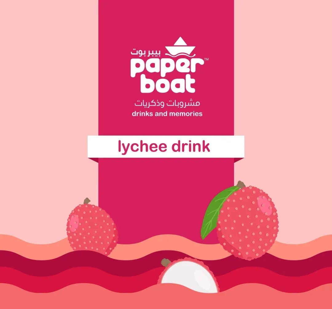
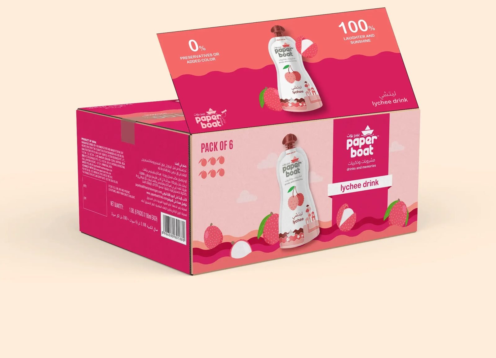
Preserve the emotional value in the existing design while finding space to add clarity. Create export cartons that feel like a natural extension of the product. Evolve the color system to balance consistency with flavor differentiation. Maintain a unified identity while allowing each product to express its character.
02 / THE APPROACH
How it took shape
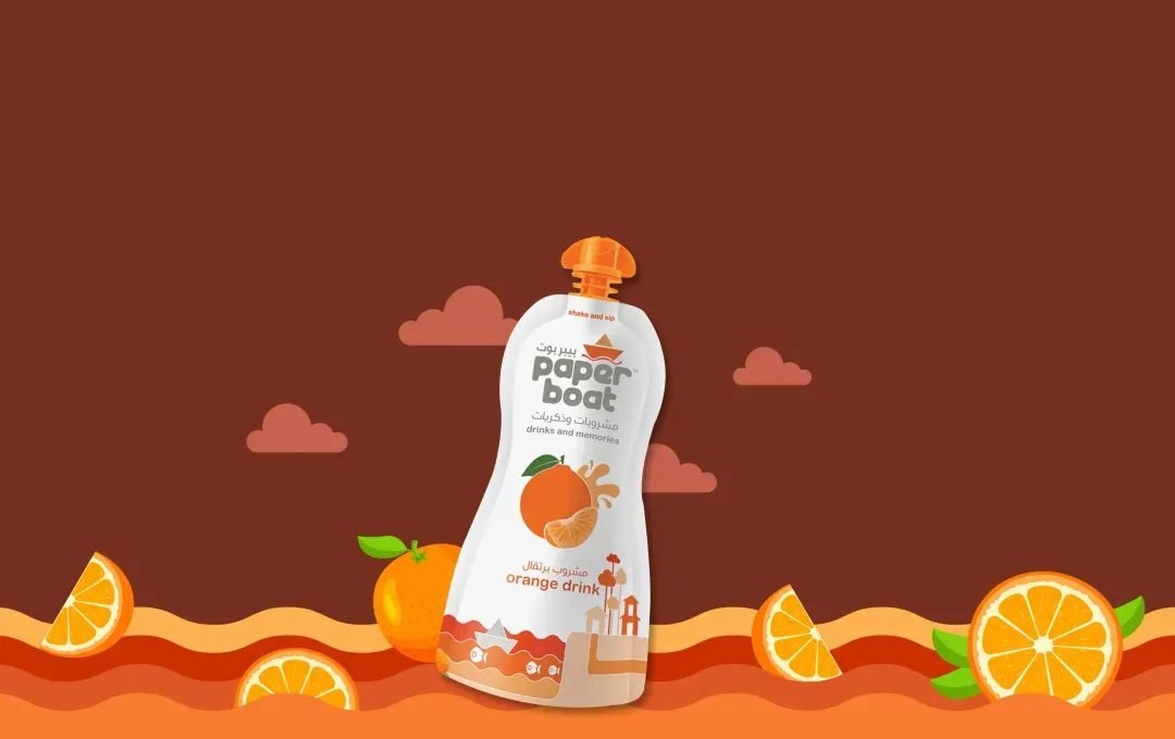
We began with a deep audit of the current system, identifying the patterns that triggered emotional recall. From there, we applied structure. A flexible grid gave consistency without constraint. Illustrations were pared back, guided by emotion rather than embellishment. Color became a language of feeling, not just flavor. Typography was tuned for tone. Layouts were driven by how a customer sees and understands information, not by aesthetic alone. The cartons now behave like quiet brand messengers. They do not speak over the product. They extend its presence.
03 / THE RESULT
What was delivered
The refined system gave Paper Boat more control and more voice. It helped long-time customers feel a renewed sense of connection and gave new consumers something instantly familiar. The design did not ask for attention. It earned it by understanding how people see, feel, and remember what they love.