01 / THE CHALLENGE
What needed solving
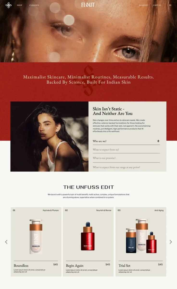
Translating a physically experienced brand into a clear and credible digital interface. Building a digital color system that accurately reflects product and packaging tones while remaining balanced and accessible across screens. Establishing typographic hierarchy to simplify complex ingredient information. Designing interactions that introduce a sense of tactility and transparency, allowing the science behind the products to be understood and trusted.
02 / THE APPROACH
How it took shape
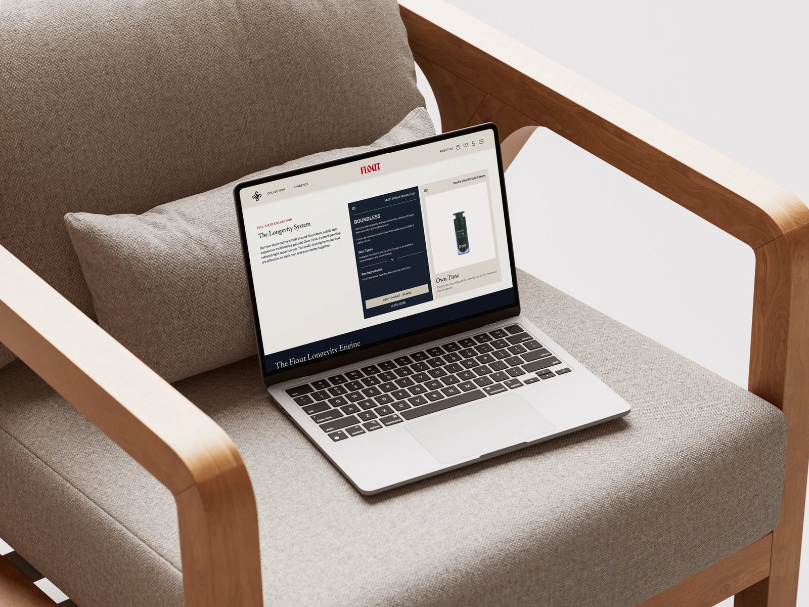
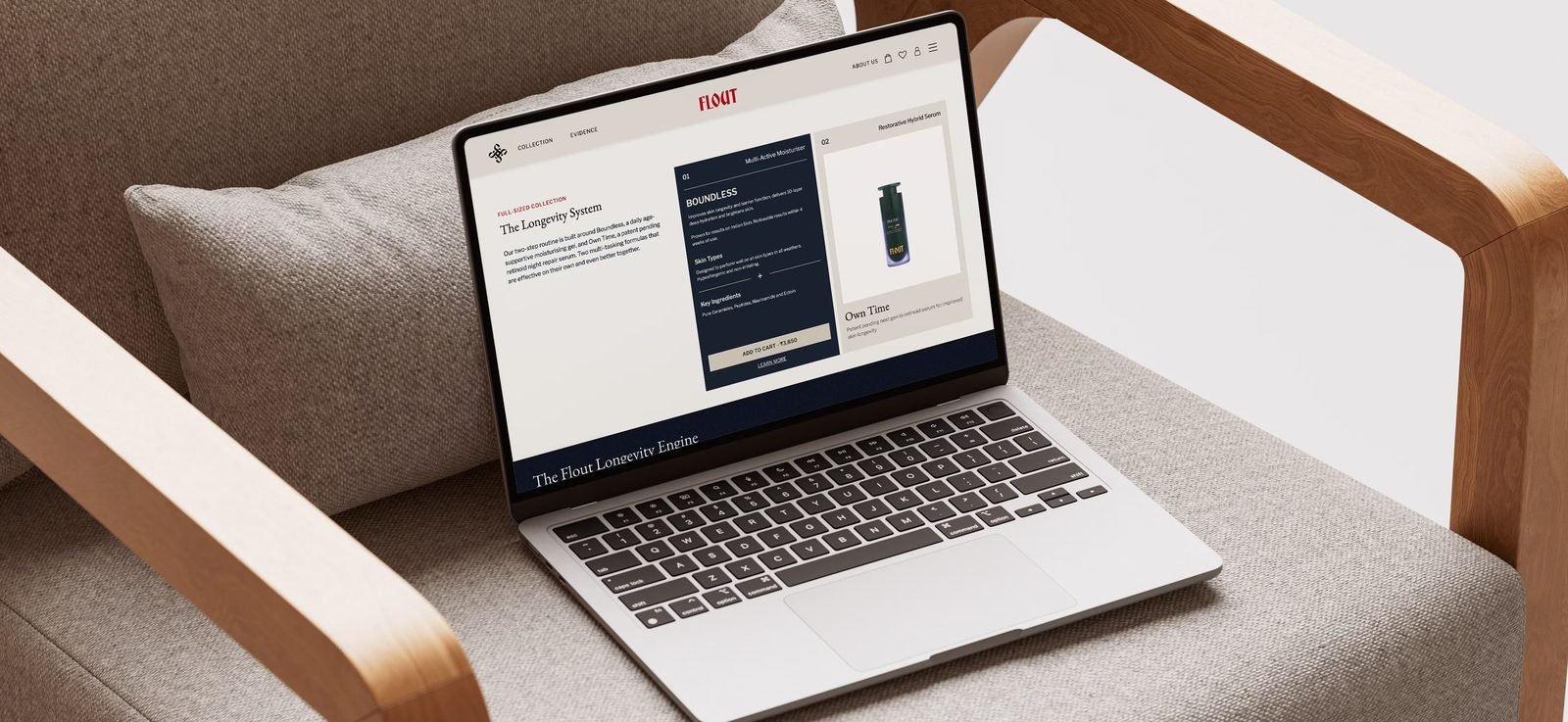
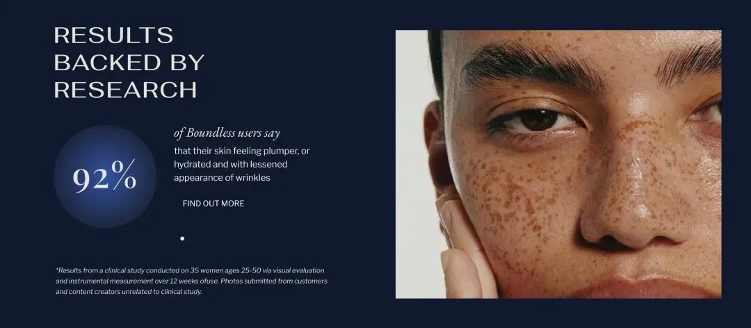
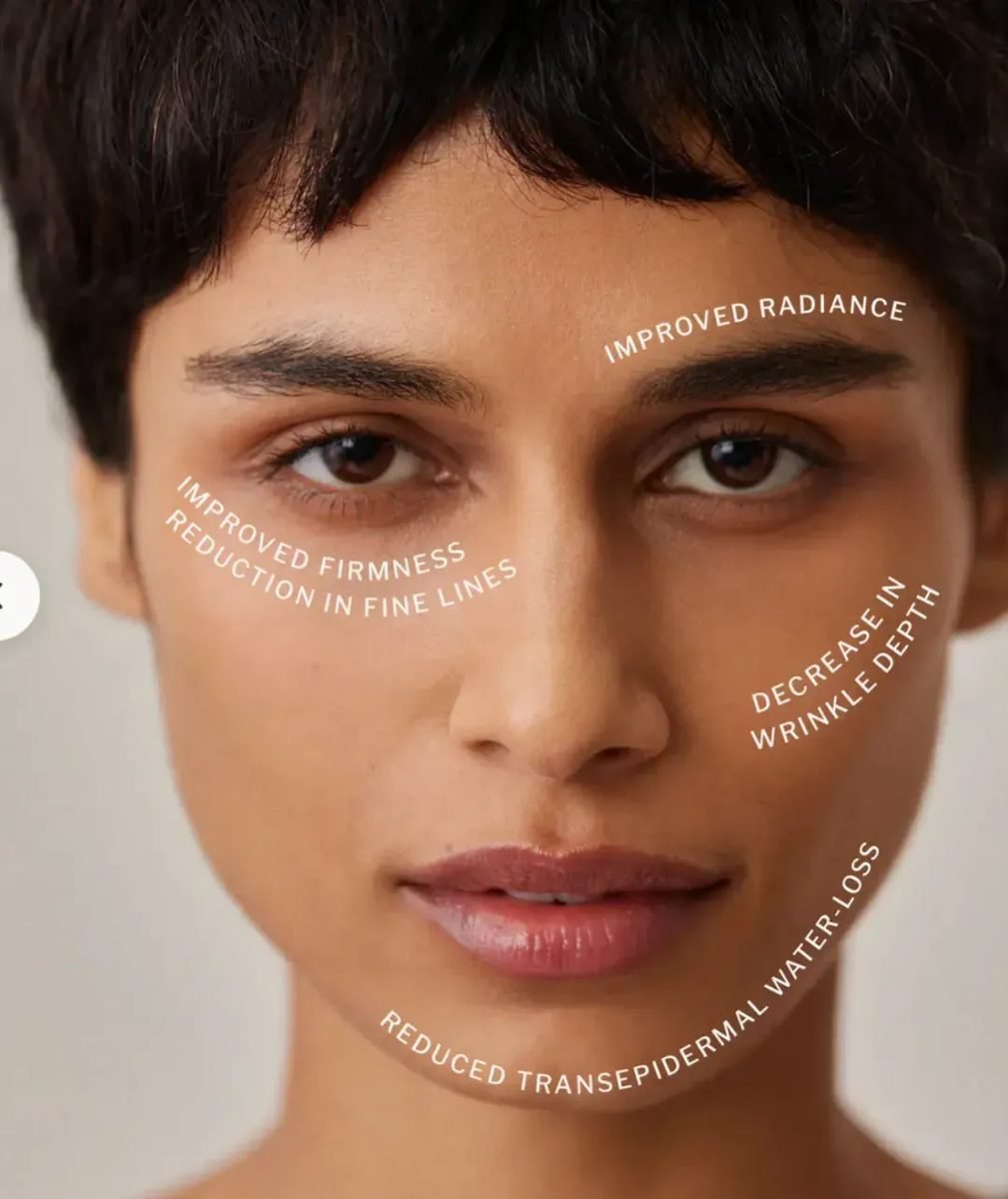
The website was designed as a considered extension of Flout’s scientific and sensorial worldview. Every element works in service of clarity, from a digitally optimised color palette aligned with physical brand cues to a clean typographic system that simplifies product and ingredient understanding. Subtle textures and visual depth introduce a sense of tactility, while transparent layouts and storytelling features bring formulation science and brand narrative into focus through a seamless, performance driven interface.
03 / THE RESULT
What was delivered
The resulting digital system positions Flout as a science led skincare brand built for longevity and trust. By aligning visual clarity with its formulation philosophy, the experience moves beyond surface appeal to communicate credibility, precision, and intent. It allows the brand to stand apart in a crowded category, offering users a sense of confidence and understanding while translating its physical sensorial quality into a considered digital presence.