01 / THE CHALLENGE
What needed solving
Positioning an local craft-led sneaker brand for a global audience without reducing it to nostalgia or souvenir thinking. Translating handwoven textiles into a modern sneaker language that feels current, wearable, and design-forward. Creating a visual identity that stands apart in a saturated sneaker market while staying rooted in origin. Balancing storytelling with commerce across packaging, digital experience, and photography, so meaning never slowed momentum.
02 / THE APPROACH
How it took shape
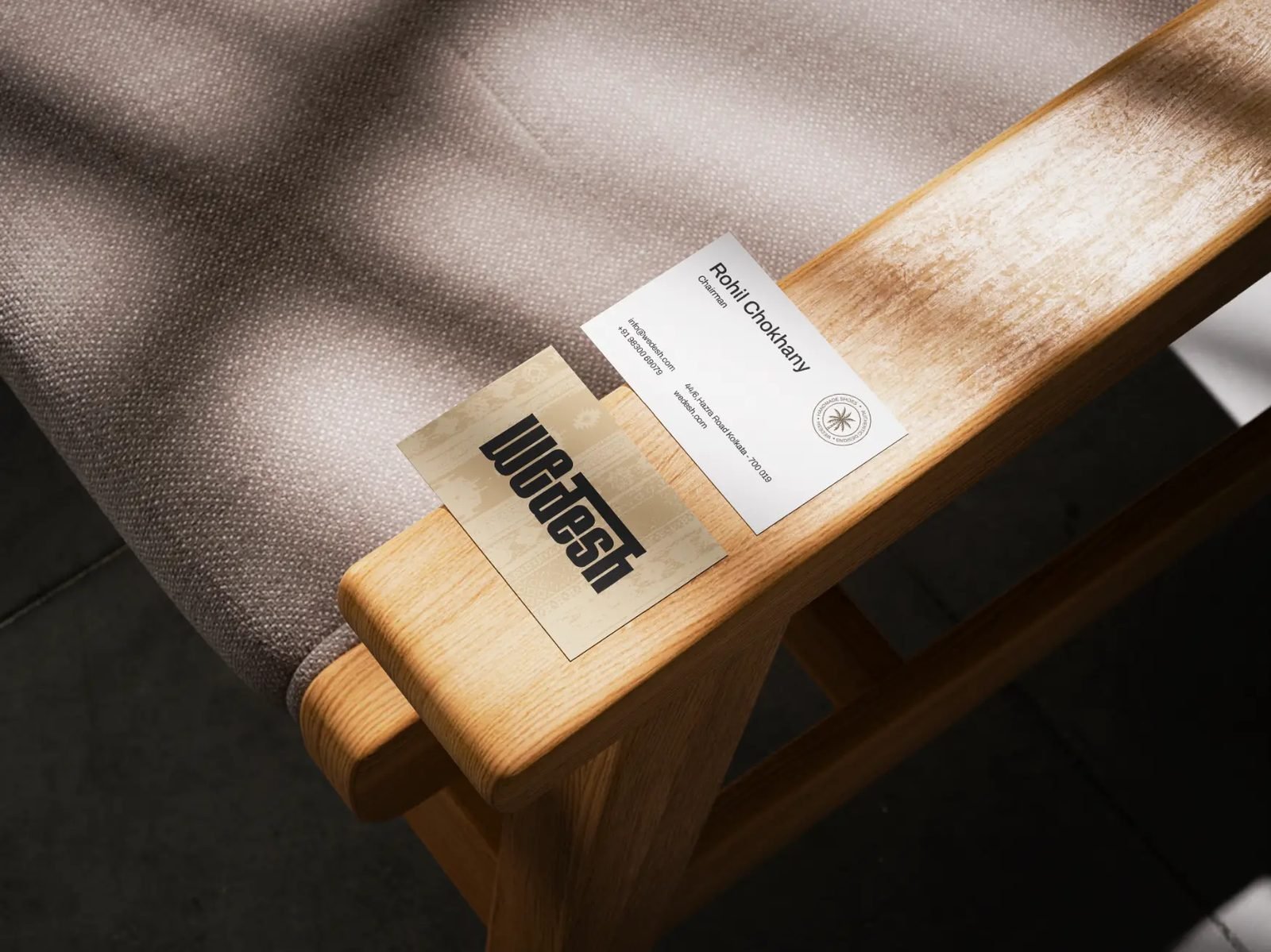
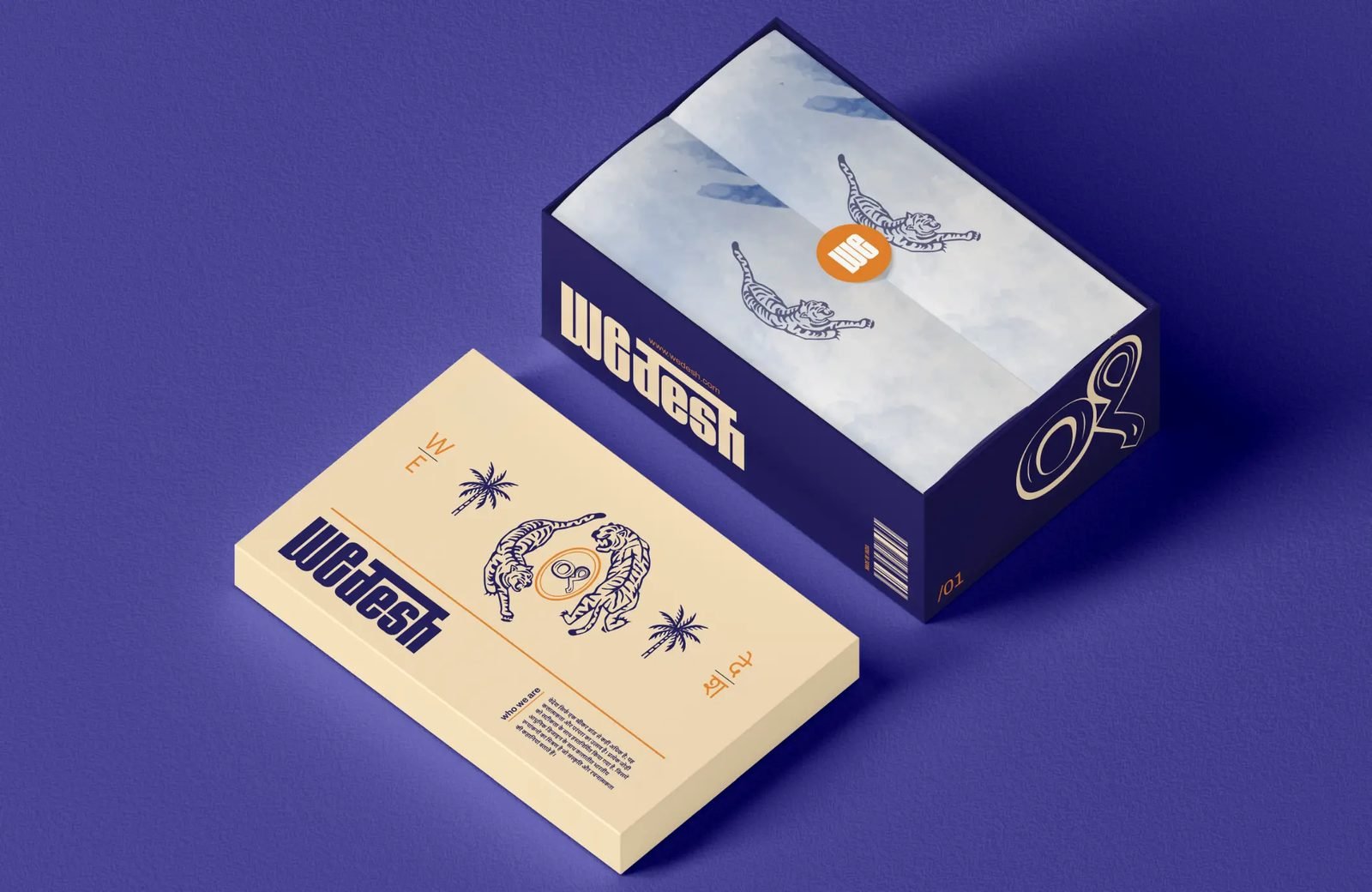
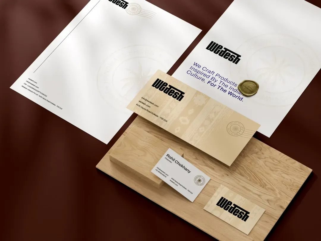
We treated Wedesh as a design-led movement, with a clear point of view, allowing craft to lead without overpowering design. The brand was shaped to honour handwoven work without freezing it in time, translating material, rhythm, and process into a contemporary sneaker language. Visual systems were kept sharp and minimal, letting textures carry meaning. Packaging, photography, and the digital experience worked together to connect story and commerce, allowing heritage to move forward, step by step.
03 / THE RESULT
What was delivered
The work gave Wedesh a system that could operate beyond geography. local making was translated into form, material, and repeatable visual systems that could function across global sneaker contexts. References to handwoven processes, material provenance, and production cues were embedded into the brand’s structure. This allowed Wedesh to move local craft out of a local frame and into a contemporary, international conversation, scaled for production, designed for wear, and built to remain intact as the brand grows.