01 / THE CHALLENGE
What needed solving
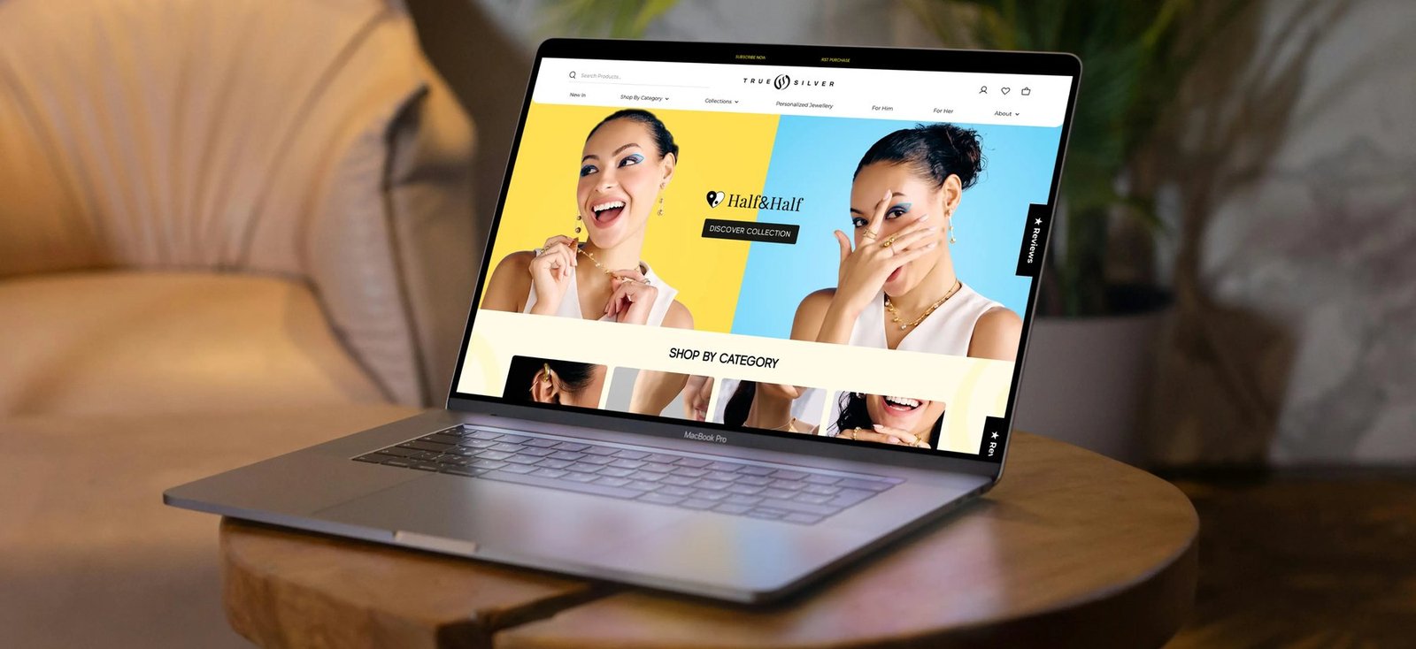
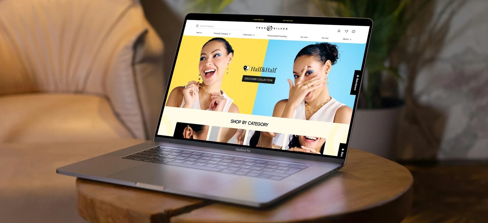
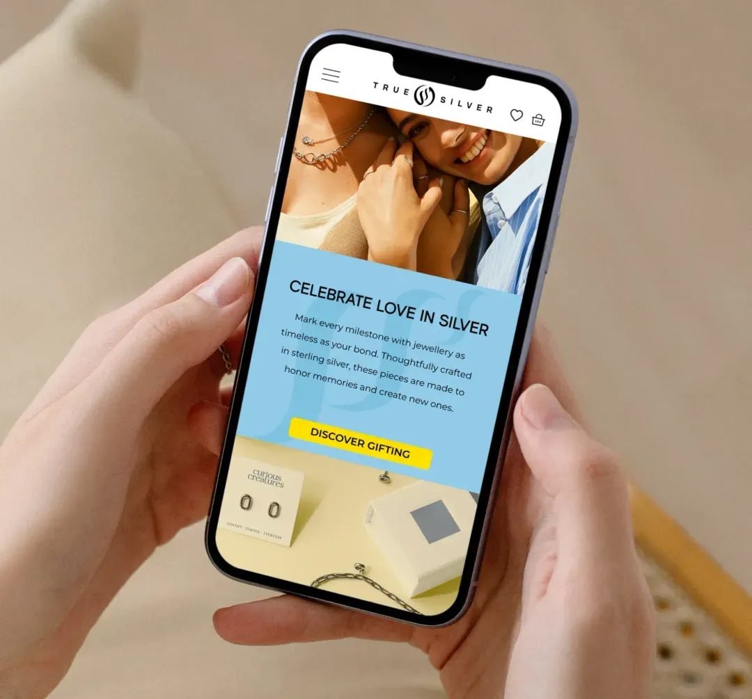
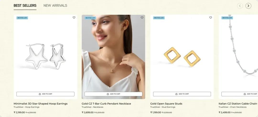
Designing an experience that feels effortless to shop while still holding the brand’s premium, polished presence. Bringing consistency to product imagery across a growing catalog with multiple contributors and varying visual inputs. Translating the brand’s tone into digital through UX writing, ensuring every touchpoint feels warm, clear, and aligned. Carrying the design intent through Shopify development without losing detail, while keeping the experience fast, responsive, and scalable.
02 / THE APPROACH
How it took shape
The work unfolded as a continuous build, where every layer informed the next. The interface was shaped to feel fluid and instinctive, imagery was given a clear visual language, and the writing was refined to carry the same tone across every touchpoint. As it came together, the experience began to feel less like a website and more like an extension of the brand itself, where product, movement, and language all sit in alignment. The development phase carried that thinking through, ensuring the final output held onto the same sharpness and ease it was designed with.
03 / THE RESULT
What was delivered
The shift shows up in how the brand is experienced. People spend more time exploring, products feel easier to navigate, and the overall journey carries a stronger sense of coherence from start to finish. What stays with you is not one feature or one moment, but the feeling that everything just fits, and that kind of clarity is what builds recall over time.