01 / THE CHALLENGE
What needed solving
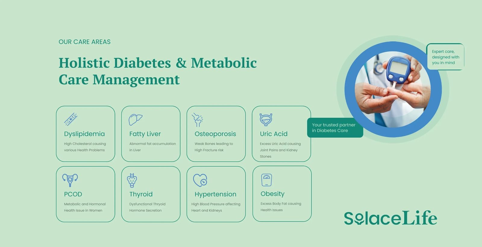
Communicate empathy while maintaining medical authority and trust. Design an interface that supports both first-time users and returning patients. Blend identity elements into a system that feels clean and emotionally grounded. Balance clinical accuracy with intuitive, accessible design choices.
02 / THE APPROACH
How it took shape
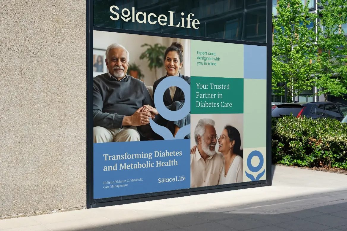
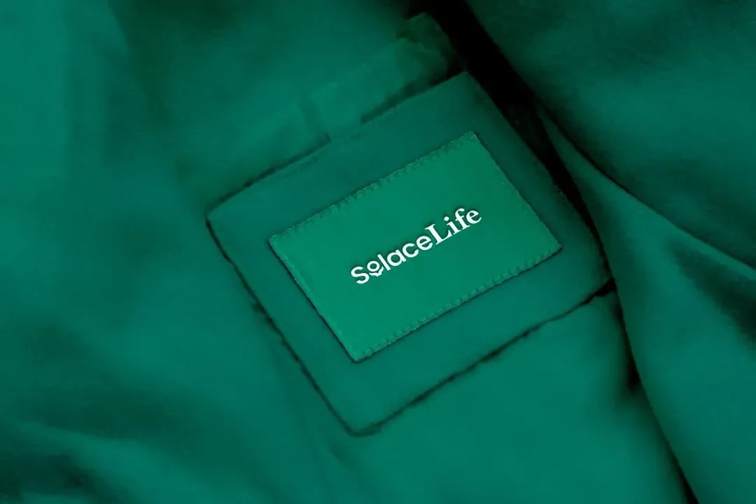
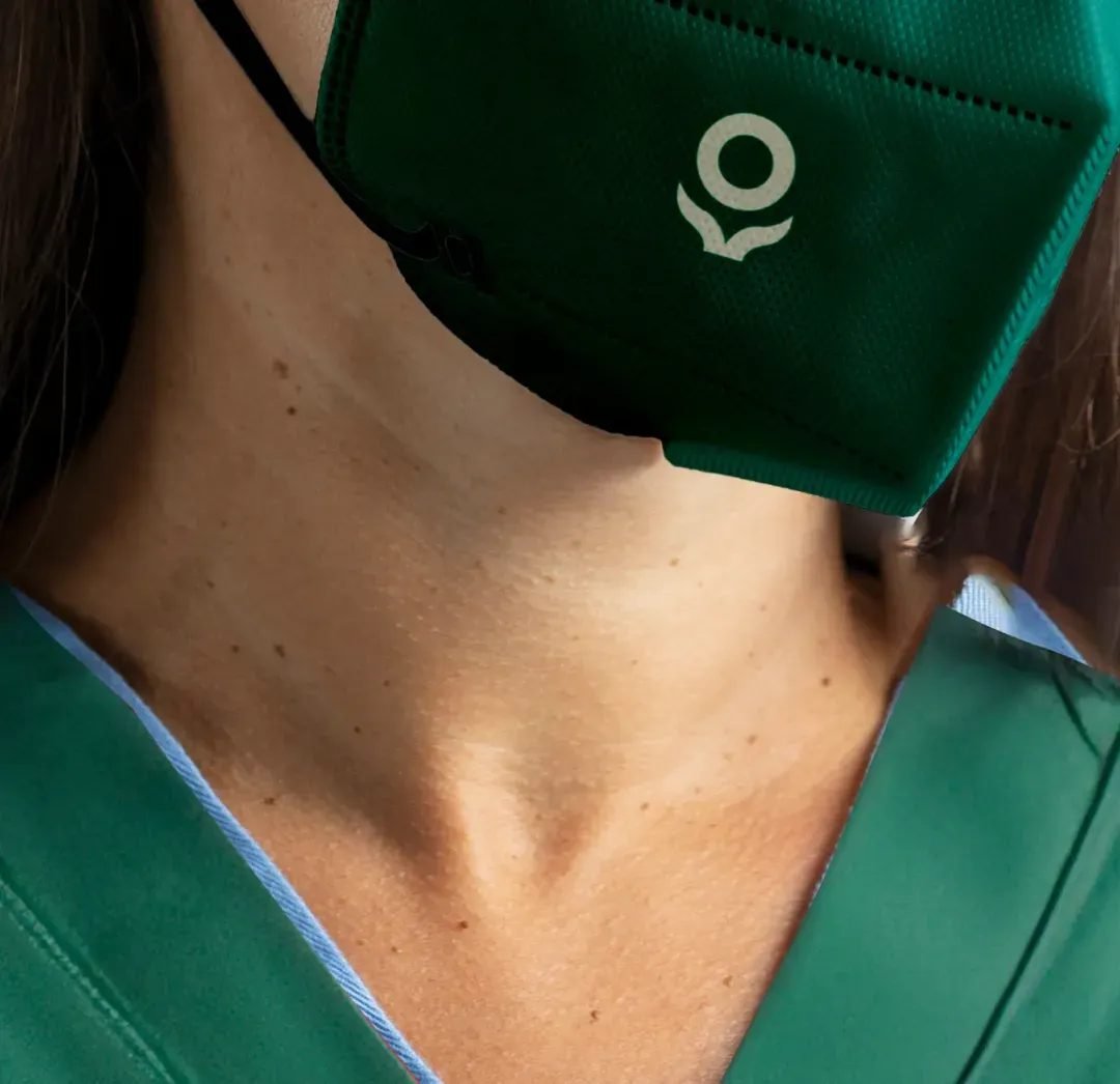
We designed a visual identity that conveyed reassurance through form and color. A palette of muted greens and soft blues carried associations of growth, balance, and trust. The logotype used rounded forms and open counters to suggest safety and calm. The "o" in the logomark features a hand-inspired form encircling a circle which is a subtle reference to support, continuity, and human connection. The interface was built with a focus on reducing friction and guiding behaviour with gentleness rather than demand.
03 / THE RESULT
What was delivered
SolaceLife now shows up with a tone and presence that is distinctly its own; grounded, thoughtful, and emotionally intelligent. The brand system brings visual calm into a space often filled with anxiety, and has helped shape a healthcare experience that feels reassuring from the first interaction.