01 / THE CHALLENGE
What needed solving
Balancing highly technical product details with a clean, intuitive interface that speaks to both industry experts and newcomers. Designing a platform that serves a diverse audience, from seasoned contractors to DIY enthusiasts, without sacrificing functionality. Enhancing product discovery through seamless navigation, ensuring users can quickly find the right fasteners for every application. Creating a cohesive, omnichannel experience that showcases both in-store and online services, making the purchase process effortless.
02 / THE APPROACH
How it took shape
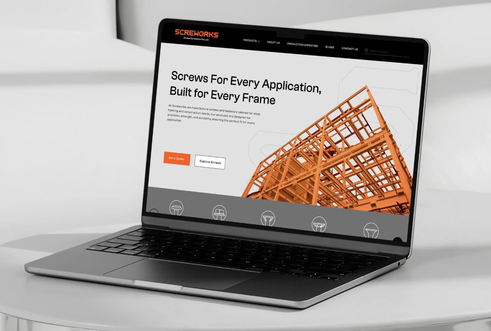
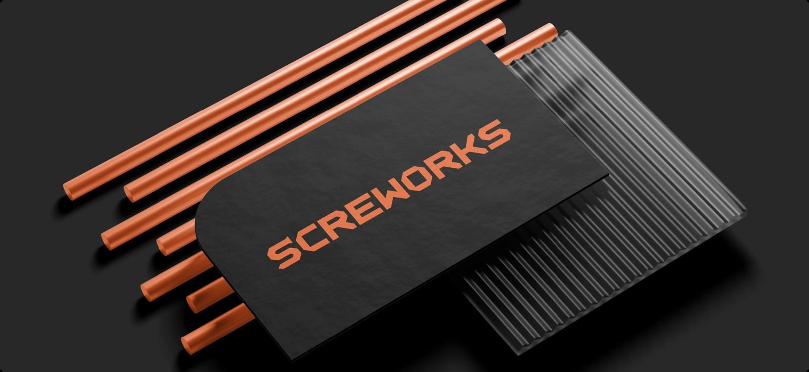
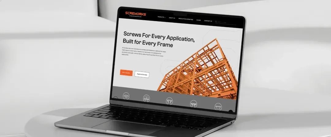
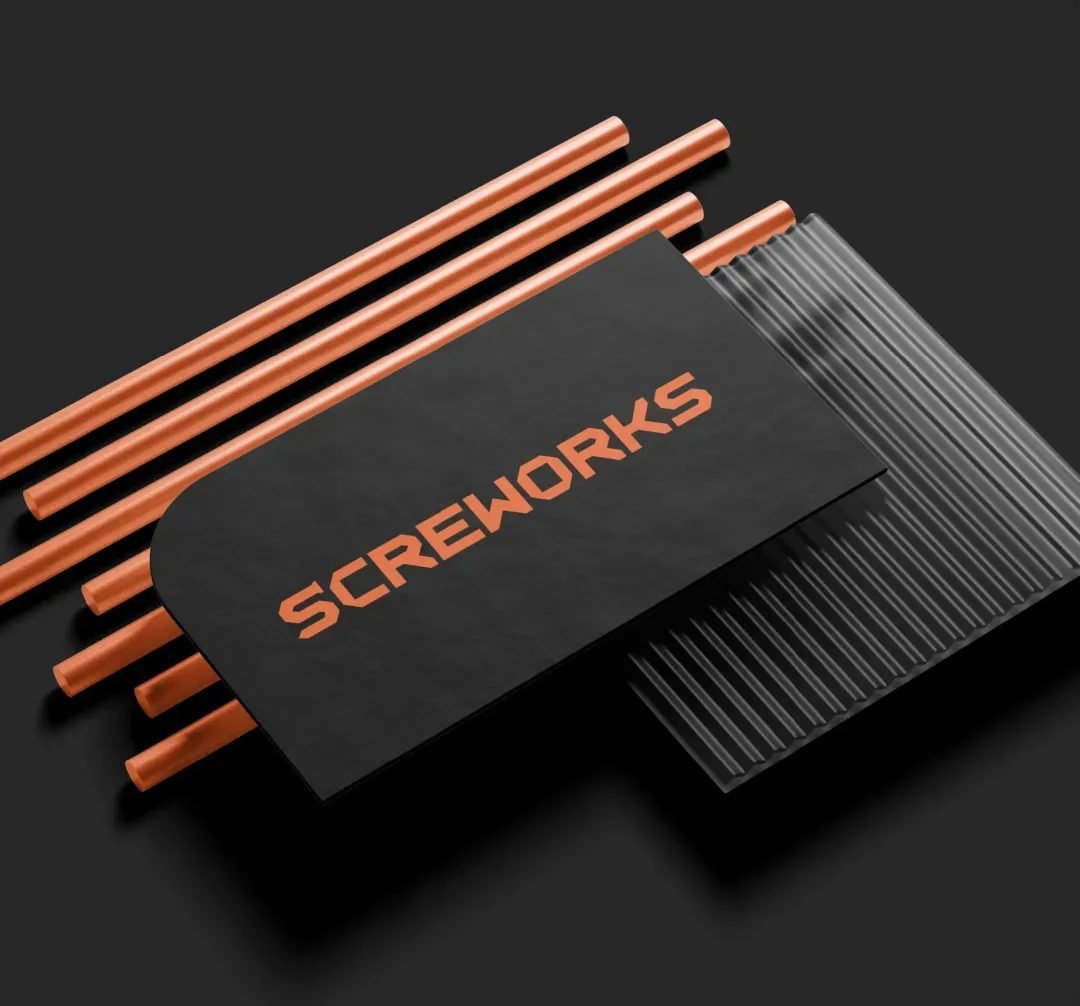
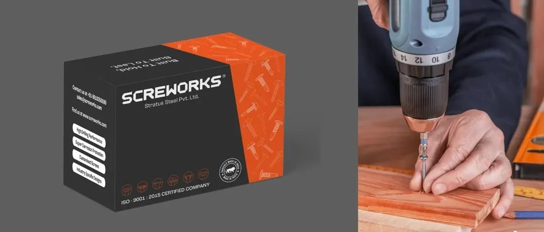
We built a brand identity that’s as strong and reliable as Screworks’ products. Rooted in their commitment to application-specific performance, quality, and trust, the visual system uses high-contrast industrial tones - black, yellow, and orange - to evoke strength, visibility, and confidence, both online and offline. The logo is bold, mechanical, and purposeful, reflecting the engineering precision that drives the brand. Every element reinforces Screworks’ position as a specialized, no-nonsense leader in the steel framing industry.
03 / THE RESULT
What was delivered
The new brand identity positions Screworks as a screw manufacturer built specifically for the steel framing industry. By aligning branding with its unique technical value proposition, Screworks now stands out as a high-trust, high-performance alternative to imported or generalized products. Its visual language has helped attract interest across domestic and export markets, placing it at the forefront of a much-needed shift in industry standards.