01 / THE CHALLENGE
What needed solving
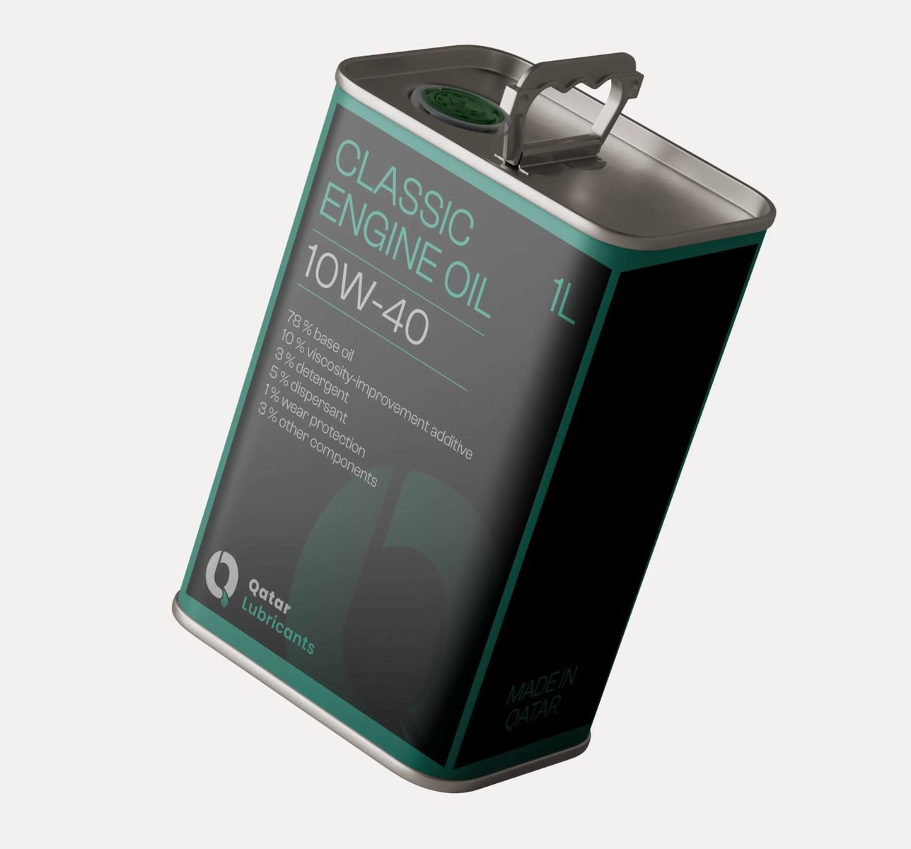
Build a bold identity that’s sleek, modern, and packed with power. Design packaging that demands attention, with every bottle exuding reliability. Ensure the brand stands out in a saturated market, blending strength with sophistication. Communicate performance and trust with effortless clarity, making every product choice obvious.
02 / THE APPROACH
How it took shape
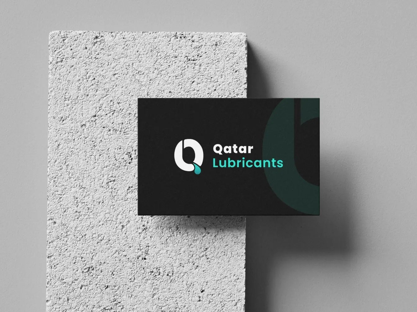
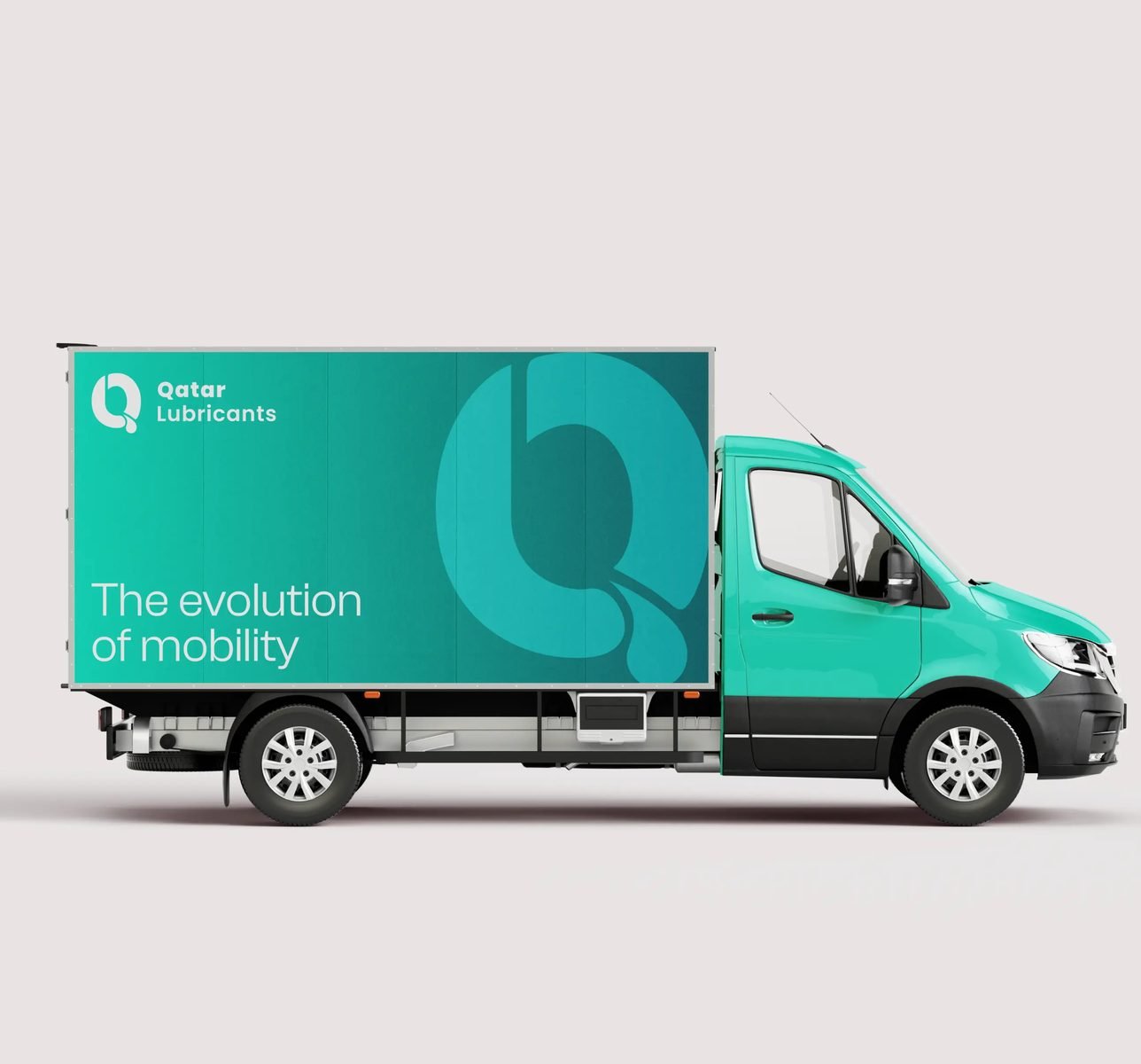
The visual identity for Qatar Lubricants exudes strength and precision, reflecting the brand's commitment to high-performance lubrication. The logo features bold, modern typography paired with deep, rich colors that evoke trust, reliability, and durability which are key qualities in the industry. The streamlined design speaks to both innovation and tradition, ensuring the brand stands out on the shelf while maintaining its authority. The iconography subtly incorporates dynamic shapes, symbolizing motion and efficiency, while reinforcing Qatar Lubricants’ mission to power engines and machines with excellence and dependability.
03 / THE RESULT
What was delivered
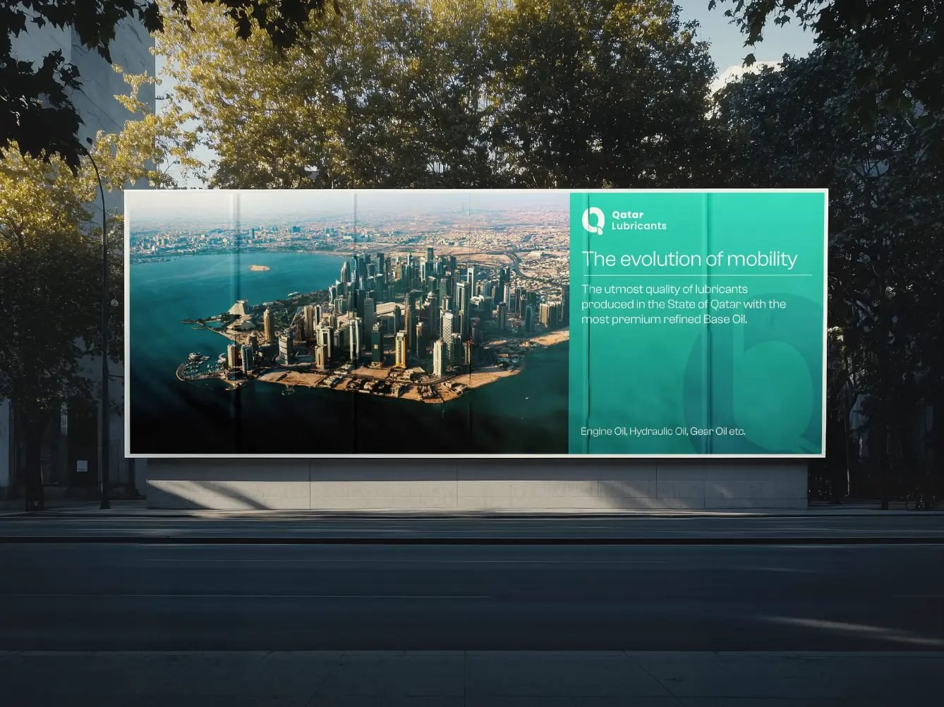
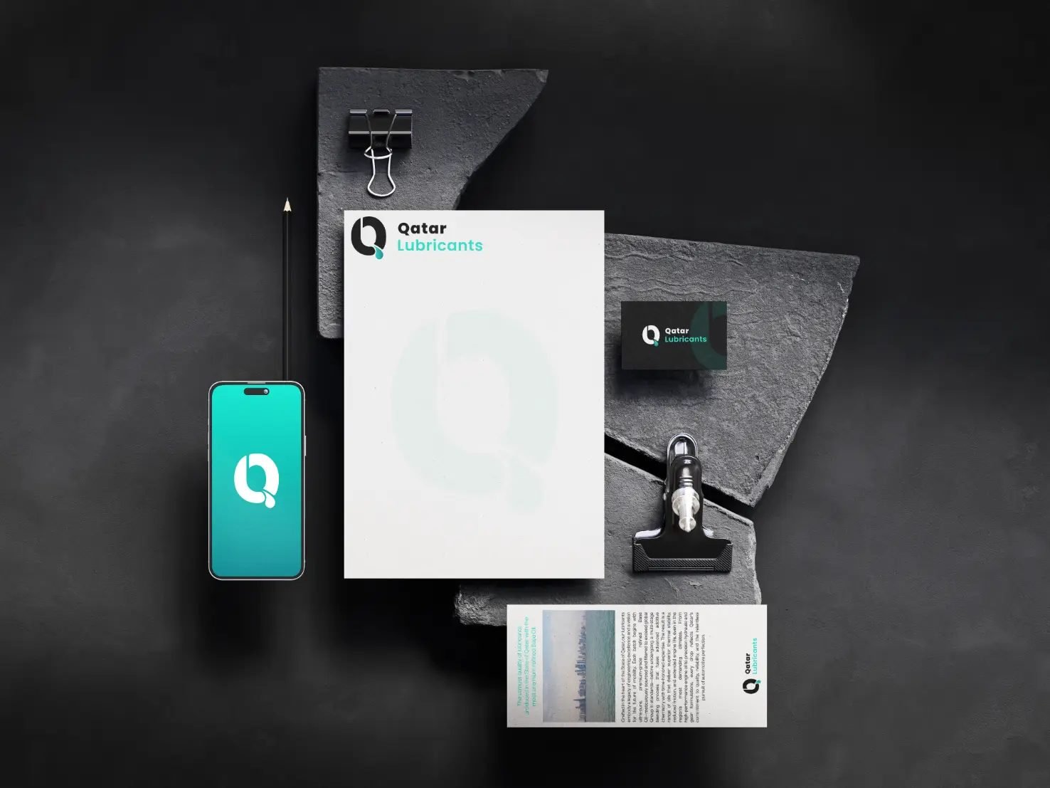
The new brand identity elevated Qatar Lubricants into a distinct and memorable presence within a highly competitive market. With a refined visual system and bold packaging design, the products now command stronger shelf visibility and instant recognition. The cohesive branding reinforced perceptions of trust, durability, and technical excellence, helping strengthen confidence among both industry professionals and everyday users.