01 / THE CHALLENGE
What needed solving
Distill a complex real estate investment model into something intent-first and easy to grasp. Create a tone and design system that signals transparency without losing authority. Define a clear, differentiated space in a market filled with legacy competitors. Craft messaging that speaks to both first-time investors and seasoned backers.
02 / THE APPROACH
How it took shape
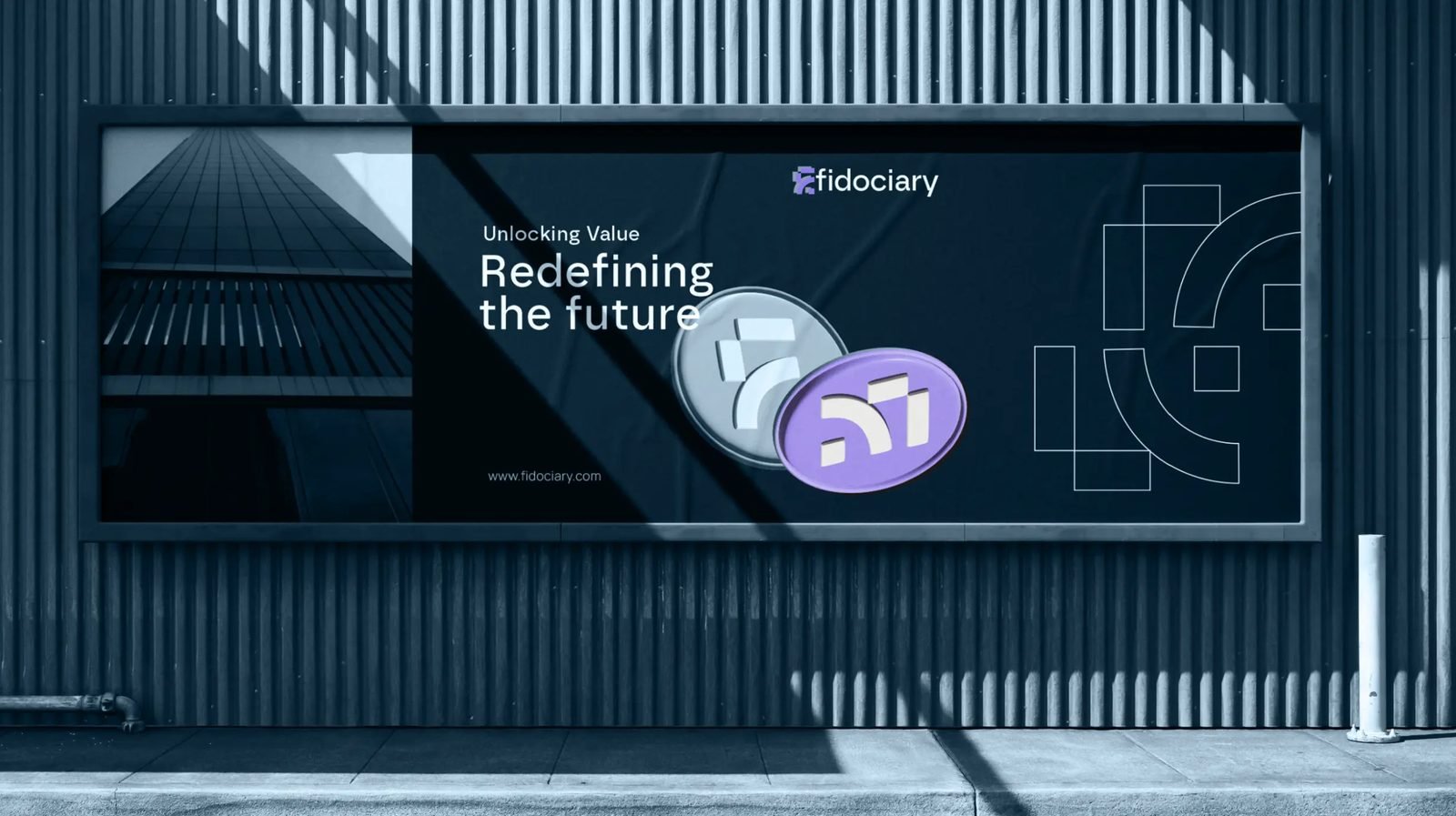
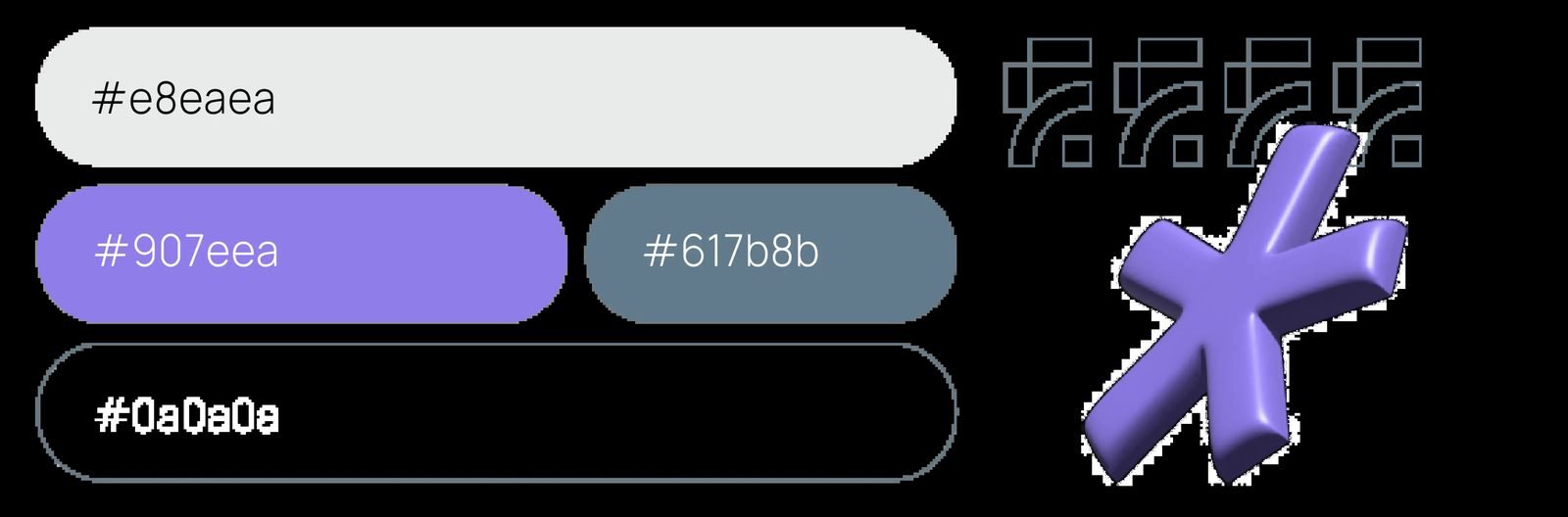
We developed a brand language built on clarity and restraint. The identity uses a considered palette of purples and greys to suggest both confidence and serenity. The design system was structured to feel modern and professional, but never cold and unapproachable. Every element, from typography to iconography, was calibrated to make the experience feel accessible without oversimplifying the product. The result is a brand that feels anchored, progressive, and ready to earn trust at scale.
03 / THE RESULT
What was delivered
The new identity helped define Fidociary as more than just another investment platform. It gave the brand a modern presence rooted in clarity and credibility. With a visual system designed to scale and a tone grounded in trust, Fidociary now enters the real estate investment space with composure, distinction, and ambition.