01 / THE CHALLENGE
What needed solving
Crafting an identity that breaks through the clutter in a crowded category. Visually representing the power of enhanced focus and performance. Perfecting color balance for packaging that pops on shelves. Building a cohesive, unforgettable brand that leaves a lasting impression.
02 / THE APPROACH
How it took shape
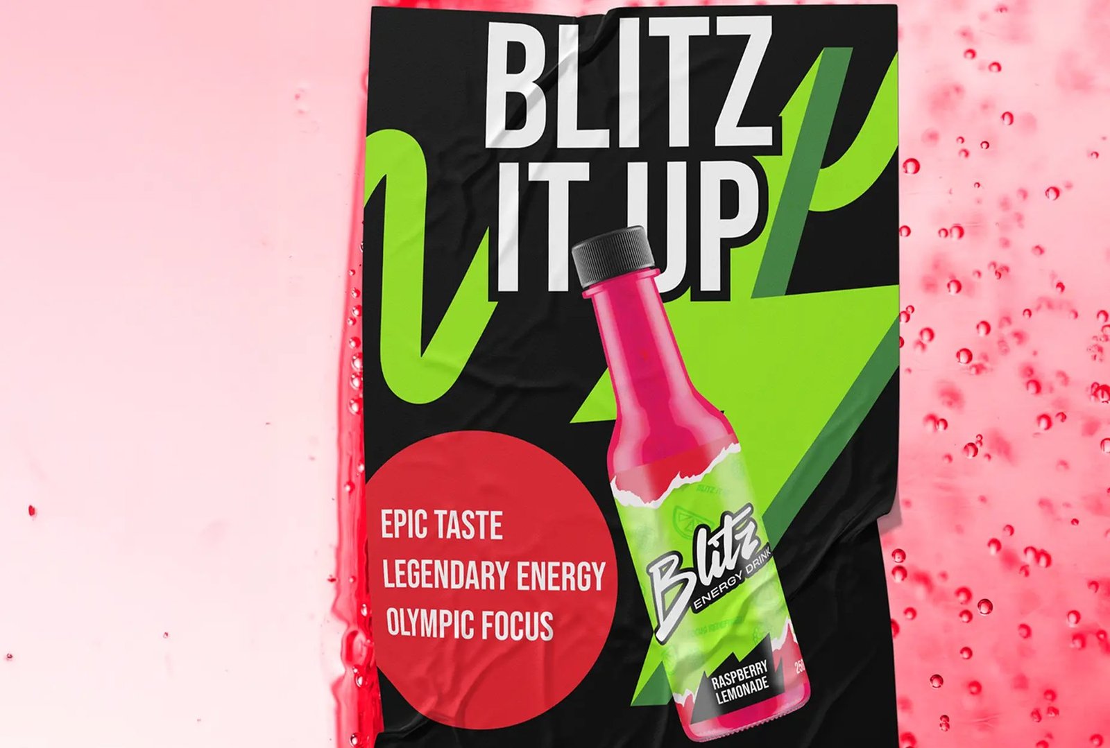
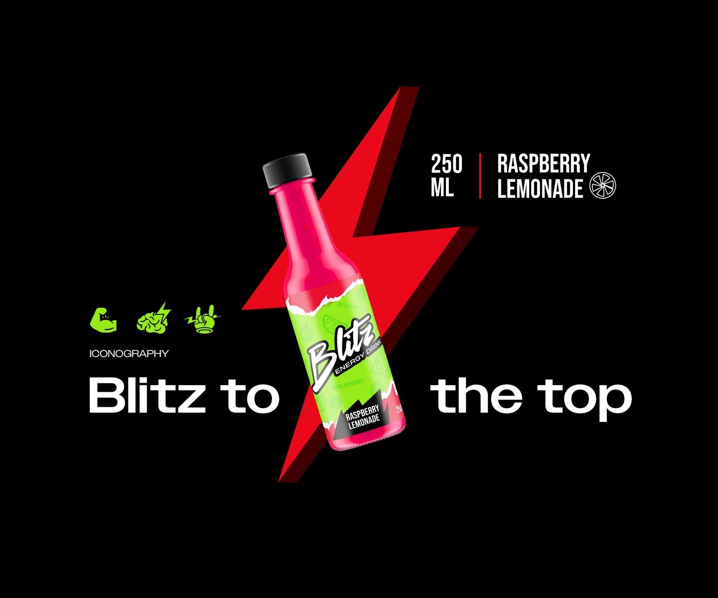
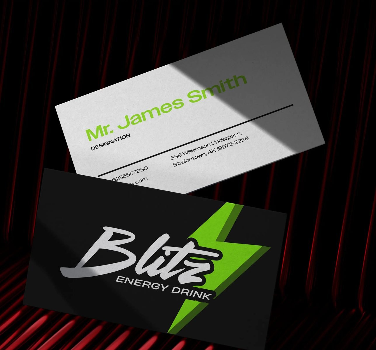
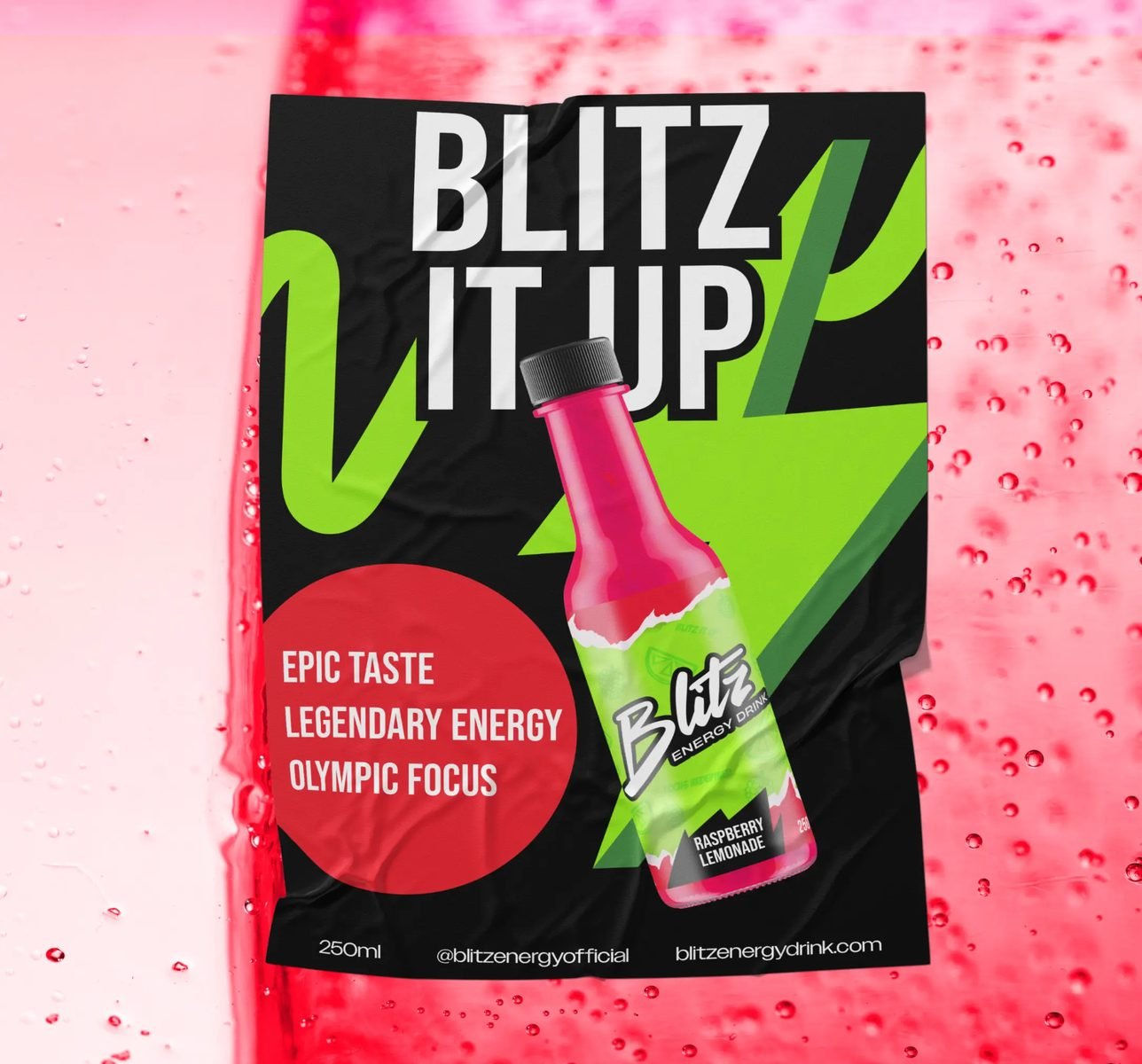
The Blitz logo blends sharp, dynamic design with clean, bold typography, symbolizing the energy and focus the brand delivers. The color palette pulses with vibrant energy, representing vitality and performance. The modular design system flexes across digital and physical spaces—whether on the web or packaging—ensuring a cohesive, high-impact brand presence. Blitz’s identity is built to stand out, capturing attention while reinforcing its commitment to peak performance and productivity.
03 / THE RESULT
What was delivered
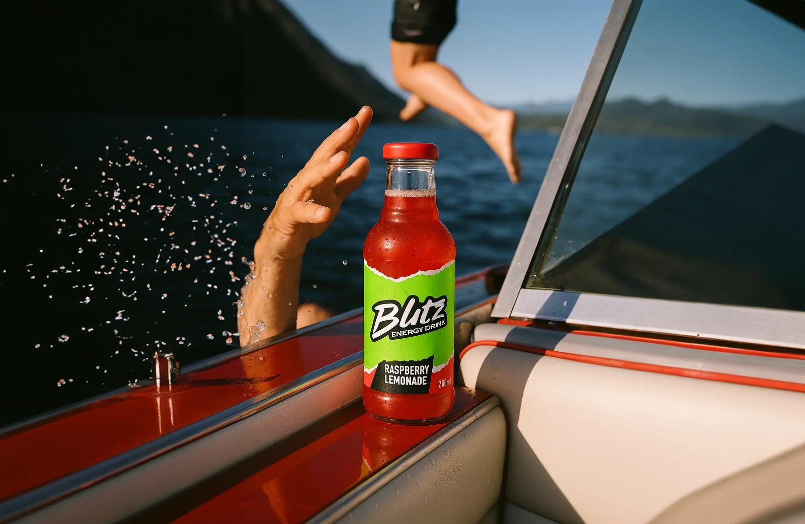
The branding and packaging for Blitz elevate its market presence, crafting a bold, dynamic identity that resonates with young professionals and knowledge workers. The striking design, featuring energetic colors like red and neon green, demands attention, ensuring Blitz stands out on shelves. By aligning with the brand’s core promise of boosting mental performance and vitality, Blitz is more than an energy drink; it’s a tool for success. This distinctive identity drives brand recognition, fosters loyalty, and sets Blitz apart from competitors focused solely on physical performance.